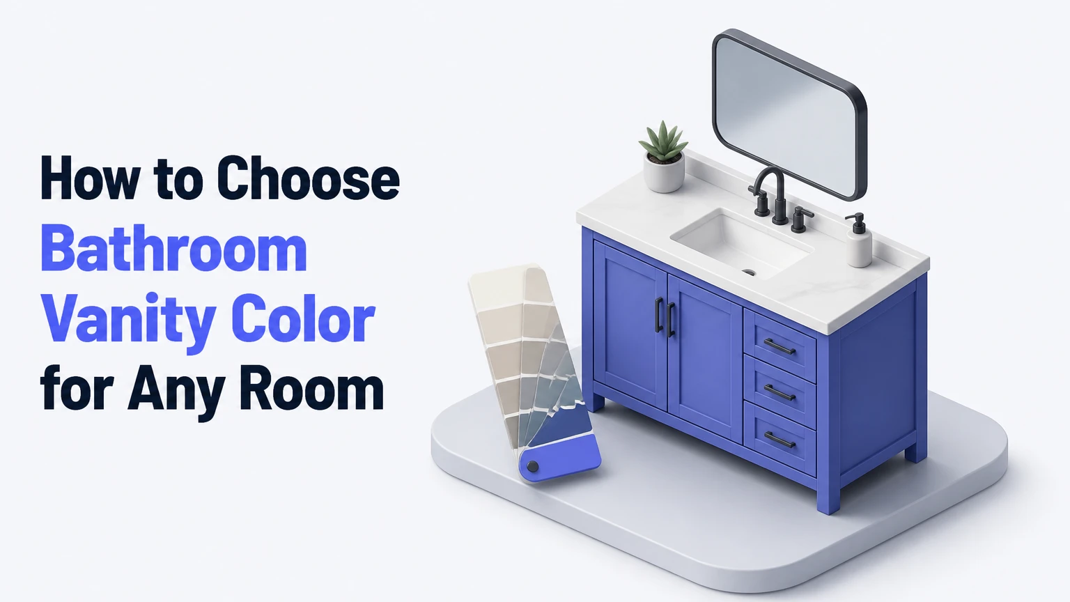
To choose a bathroom vanity color, evaluate the room’s fixed finishes, natural and artificial light, size, maintenance demands, and design style before selecting a paint, stain, or laminate. Test large samples inside the bathroom at several times of day, then coordinate the vanity with the countertop, tile undertones, flooring, wall color, and plumbing hardware.
Key Facts at a Glance
- Bathroom vanity color influences the room’s visual weight because the vanity is usually its largest freestanding furniture element.
- Light vanity finishes increase perceived brightness, but a high-light-reflectance color cannot compensate for inadequate bathroom lighting.
- A vanity should coordinate with the undertones of permanent finishes, not necessarily match the floor or wall tile exactly.
- The 60-30-10 color rule is a flexible composition guide, not a technical requirement for bathroom design.
- Light reflectance value, or LRV, describes how much light a surface reflects; LRV does not predict whether a color will look warm or cool.
- Bathroom cabinet enamel, proper surface preparation, and ventilation matter more for durability than color alone.
What Does Vanity Color Control?
Bathroom vanity color controls visual emphasis, perceived room brightness, style direction, and the relationship between the sink cabinet and surrounding finishes. Because the vanity sits near eye level and occupies a concentrated area, a saturated or very dark finish attracts attention more strongly than a pale neutral finish.
Color also changes perceived scale. White, pale oak, and light gray reduce visual weight, while charcoal, black, espresso, and deep green create a more substantial furniture effect. That effect can improve a large bathroom, but it may make a narrow bathroom feel visually compressed when the cabinet, floor, and walls all have dark values.
The vanity is not an isolated color decision. A white cabinet beside blue-white tile can appear gray or icy, while the same cabinet beside cream limestone may appear stark. The surrounding surfaces determine how the finish is perceived.
How Do Size and Lighting Change the Choice?
Small bathrooms usually benefit from a light or medium-value vanity, especially when the cabinet sits opposite a mirror or blocks part of a window. Larger bathrooms and powder rooms can handle deeper colors because they provide more visual space and often use the vanity as a deliberate focal point.
Lighting determines whether a color reads clean, muddy, yellow, blue, or gray. Test samples under the bathroom’s actual bulbs because a 2700K warm-white lamp can intensify beige and wood undertones, while a 4000K neutral-white lamp can make cream look dull or greenish.
Light reflectance value provides useful context, but LRV is not a universal cutoff. Benjamin Moore describes LRV as a scale from 0, absorbing black, to 100, reflecting white; a vanity with an LRV above 50 may help a dim room feel lighter, but tile sheen, mirror size, bulb output, and wall color also affect the result.
Practical lighting ranges
| Bathroom condition | Typical light setup | Suitable vanity value | Main risk |
|---|---|---|---|
| Windowless half bath | 2700-3000K LED, 800-1,600 lumens | LRV 45-80 | Warm bulbs muddy gray and blue |
| Small bathroom with window | Daylight plus 3000-4000K LED | LRV 35-75 | Strong daylight changes undertones |
| Large primary bathroom | 3000-4000K layered lighting | LRV 20-70 | Dark finishes dominate sightlines |
| Makeup-focused bathroom | CRI 90 or higher, 3500-4000K | LRV 35-80 | Low-CRI bulbs distort skin and paint |
Use high-CRI lighting where color accuracy matters. The U.S. Department of Energy notes that color rendering index measures how accurately a light source reveals colors compared with a reference source; CRI does not measure brightness, so both lumen output and CRI deserve attention.
How Do You Match Fixed Bathroom Elements?
Match a vanity to the undertones and value of permanent surfaces, not to a color name on a paint card. Examine the countertop, floor tile, shower tile, grout, bathtub, wall tile, and metal plumbing finishes together before choosing the cabinet.
An undertone is the subtle warm, cool, pink, green, blue, or violet bias beneath an apparent neutral. A “gray” countertop may contain blue undertones, whereas a gray vanity with a violet undertone can clash even when both surfaces are labeled gray.
Use one of three relationships:
- Coordinated: the vanity shares an undertone with the tile but differs in value.
- Contrasting: the vanity deliberately opposes the tile’s value or hue.
- Integrated: the vanity and wall are close in color, reducing visual boundaries.
Exact matching is usually less successful than controlled coordination. Wood flooring and a wood vanity should differ in stain value, grain scale, or undertone by enough to look intentional.
Fixed-finish matching guide
| Existing finish | Vanity color direction | Useful hardware | Avoid |
|---|---|---|---|
| Cool white subway tile | Soft white, blue-gray, natural oak | Chrome, nickel, black | Yellow cream beside blue grout |
| Cream limestone tile | Warm white, mushroom, walnut | Brass, bronze, aged nickel | Icy gray with blue undertone |
| Terrazzo with black chips | White, charcoal, muted green | Black, chrome, brass | A fourth unrelated accent color |
| Gray porcelain tile | Oak, charcoal, neutral white | Black, nickel, brass | Purple-gray against blue-gray tile |
| Warm beige floor tile | Sage, terracotta, medium oak | Brass, bronze, black | Cool lavender or icy blue |
Which Vanity Colors Work Best?
The best bathroom vanity color depends on room brightness, fixed undertones, cleaning habits, and how permanent the design needs to be. White and natural wood offer broad compatibility, while charcoal, navy, green, and black create stronger identity with greater coordination requirements.
White and cream
White is the safest choice for a small bathroom, rental property, or resale-oriented renovation because it maintains visual lightness and works with many countertop materials. Pure white can look sterile beside cool lighting, while warm white or cream can look yellow beside bright neutral LEDs.
Choose white when the countertop or tile already supplies pattern. Avoid matching a bright white vanity to a creamy countertop, because the cabinet can make the countertop appear dirty.
Gray and charcoal
Light gray works well with white, concrete-look, and gray porcelain finishes. Charcoal creates contrast without the full intensity of black and generally hides minor dust better than a glossy white surface.
Gray is highly sensitive to undertone. Blue-gray suits cool tile; greige suits warm stone. A neutral gray can look blue beside beige walls or brown beside blue-white tile.
Black
Black produces the strongest furniture effect and can make a powder room feel intentional and dramatic. Matte black hides some fingerprints, but water spots and mineral residue may remain visible, particularly in hard-water areas.
Black works best when the room contains repeated dark details, such as a mirror frame, window trim, floor pattern, or lighting fixture. In a small bathroom, use a reflective mirror and pale walls to prevent the cabinet from becoming a heavy visual block.
Natural wood
Light oak and birch add warmth without the density of espresso or walnut. Medium oak and walnut suit transitional and mid-century interiors, while dark wood grounds a bright, spacious bathroom.
Wood is not automatically more durable than paint. Unsealed edges, sink cutouts, and particleboard substrates can swell when water penetrates them. Confirm that the finish is intended for bathroom humidity and wipe standing water from the cabinet base.
Navy and blue
Navy offers a reliable statement color because it pairs with white tile, marble-look quartz, nickel, and brass. Blue works particularly well in coastal, traditional, and contemporary bathrooms, but strong blue can expose the undertones of adjacent gray surfaces.
Pale blue increases softness but may look washed out in a bright room. Deep navy gives more contrast and usually needs a lighter countertop or wall to retain balance.
Green
Sage green supports natural wood, cream tile, and brushed brass. Forest and emerald green create a more formal effect and require careful control of surrounding colors.
Green is a poor choice when the room already has strong green-gray stone unless the undertones are deliberately aligned. Sample the cabinet beside the stone, because green paint can pull yellow, gray, or blue depending on the lighting.
Blush and terracotta
Blush suits warm white, brass, and pale stone in a soft contemporary bathroom. Terracotta provides stronger warmth and pairs well with oak, cream, and matte black.
These colors are less flexible than neutrals. They are best used when the wall, tile, or artwork already supports a warm palette rather than as an isolated accent.
What Is the Best Vanity Color for Your Bathroom?
The best color changes by room condition and user priority. A pale neutral is the broadest recommendation, but a medium wood or dark painted finish may perform better when the bathroom has heavy family use, abundant light, or a deliberately dramatic style.
| Bathroom situation | Recommended color | Typical finish | Why it works | Main limitation |
|---|---|---|---|---|
| Small, windowless bathroom | Warm white or light oak | Satin or eggshell | Preserves brightness and warmth | Shows splash marks |
| Large primary bathroom | Walnut, charcoal, or sage | Satin | Adds furniture presence | Needs coordinated tile |
| Powder room | Black, navy, or emerald | Matte or satin | Supports a high-impact focal point | Less forgiving of mismatched accents |
| Family bathroom | Medium oak or mid-gray | Satin enamel | Masks light scuffs and fingerprints | May feel heavy in a narrow room |
| Rental or resale project | White, greige, or light gray | Factory laminate or enamel | Broad buyer compatibility | Less distinctive |
| Warm stone bathroom | Mushroom, sage, or walnut | Satin | Repeats existing warm undertones | Cool metals may clash |
For resale
Use white, light gray, greige, or medium natural wood when resale flexibility matters more than personal expression. These finishes leave more options for towels, wall paint, and replacement hardware.
A bold navy or green vanity does not automatically reduce resale value, but it narrows the number of surrounding palettes that look coherent. A buyer can repaint a vanity, yet the labor and preparation remain part of the perceived risk.
For busy households
Medium oak, walnut, charcoal, and mid-tone blue-gray are practical choices for bathrooms used by children or several adults. These finishes conceal small smudges better than bright white, while satin surfaces are easier to wipe than heavily textured finishes.
Dark glossy cabinets are a weaker choice for high-touch bathrooms because fingerprints and dried droplets become visible under overhead lighting. Color helps maintenance only at the margin; sheen and surface texture often matter more.
Step 1: Inventory the Bathroom’s Permanent Colors
Photograph the room and list every finish that will remain after the vanity changes. Include floor tile, shower tile, grout, countertop, sink, bathtub, wall paint, mirror frame, faucet, towel hardware, and light fixtures.
Write down whether each surface is warm, cool, or uncertain. Compare physical samples rather than relying on phone photographs, because cameras routinely alter white balance and saturation.
You will know this step worked when: you can identify one dominant undertone and at least one repeated accent finish.
Common mistake: choosing a cabinet from a showroom photograph without comparing it with the existing countertop.
Step 2: Measure Size and Sightlines
Record bathroom length, width, ceiling height, vanity width, and the distance from the vanity to the opposite wall. Note whether the cabinet blocks a window, occupies the first view from the doorway, or sits beside a shower enclosure.
A 24-inch vanity in a narrow room has a different visual effect from a 72-inch double vanity in a bright primary suite, even when both use the same paint color. The larger cabinet carries more visual weight and should usually have a simpler surrounding palette.
You will know this step worked when: you can describe whether the vanity should recede, balance, or dominate the room.
Common mistake: assuming that a small room cannot use dark color. A dark powder room can work when the finish is intentional and the lighting is sufficient.
Step 3: Evaluate the Actual Light
Check the room at morning, afternoon, and evening if it has a window. Turn on every bathroom light, then inspect samples under the bulbs you actually use.
Use 3000-4000K LEDs for a balanced residential appearance, but prioritize the room’s purpose. A bathroom used for makeup or shaving benefits from CRI 90 or higher, while a decorative powder room may prioritize atmosphere.
You will know this step worked when: the candidate color remains acceptable in both daylight and artificial light.
Common mistake: changing from 2700K to 4000K solely to neutralize yellow paint. The bulb may improve the cabinet while making skin tones, wood, or warm tile look unnaturally cool.
Step 4: Choose the Color Relationship
Select whether the vanity will coordinate with, contrast against, or blend into the surrounding surfaces. Then choose a value range before comparing precise paint names.
For example, a bathroom with cream tile may need a warm white vanity that is slightly darker than the tile, a walnut vanity that repeats the floor’s warmth, or a sage vanity that provides controlled contrast. The decision becomes clearer when value and undertone are separated.
You will know this step worked when: you can explain the vanity’s relationship to the tile in one sentence.
Common mistake: applying the 60-30-10 rule mechanically. Bathroom surfaces rarely divide into exact percentages, and a patterned floor may already contain several colors.
Step 5: Collect Large Samples
Obtain cabinet doors, laminate chips, wood stain boards, or painted boards at least 12 by 12 inches. Small paint chips hide undertones and do not show how a finish responds beside a countertop.
Place samples vertically where the vanity will stand. View them beside the sink, floor, wall, and hardware, because adjacent colors alter perception through simultaneous contrast.
You will know this step worked when: one or two samples remain acceptable without depending on a single nearby object.
Common mistake: testing a color flat on a wall. A horizontal countertop, vertical cabinet face, and glossy backsplash receive light differently.
Step 6: Confirm Sheen, Material, and Hardware
Select the material and sheen with color. Satin cabinet enamel is a practical painted-vanity finish because it provides wipeability without the intense reflection of high gloss; manufacturer instructions still control recoat time and curing requirements.
Coordinate hardware by temperature and contrast. Brushed brass warms navy, sage, cream, and walnut, while chrome and polished nickel reinforce cool white, blue-gray, and modern monochrome palettes. Matte black creates graphic contrast with nearly every medium or light cabinet.
You will know this step worked when: the cabinet finish, faucet, countertop edge, and mirror frame look like one planned system.
Common mistake: treating hardware as a late accessory. A warm wood vanity with orange undertones can conflict with rose gold or pink metal even when each item looks attractive alone.
How Much Contrast Should a Vanity Have?
A vanity generally needs enough value contrast from the wall or floor to remain legible, but no universal 30% contrast threshold governs bathroom design. Contrast depends on cabinet size, edge definition, lighting, and whether the desired effect is a floating, integrated, or furniture-like vanity.
Use these practical relationships:
- Choose a vanity 15-30 LRV points lighter or darker than a plain wall for clear separation.
- Use a near-matching wall and vanity when you want a small room to feel less segmented.
- Pair a dark cabinet with a lighter countertop when the cabinet already dominates.
- Repeat the vanity color in at least one smaller element, such as a frame, sconce, or towel.
The 60-30-10 rule can organize a palette, but bathroom proportions often make the vanity closer to 10-20% of visible color rather than a fixed 30%. Treat the rule as a starting framework, not a measurement standard.
What Does a Vanity Color Change Cost?
A typical DIY vanity repaint costs approximately $75-$250 in materials in the United States, while professional cabinet refinishing commonly costs $300-$1,200 for a standard bathroom vanity. Replacement costs often begin around $500 for a basic stock unit and exceed $3,000 for custom cabinetry, excluding major plumbing changes.
Regional labor, vanity width, door count, substrate condition, and spray versus brush application create wide variation. Prices in the AI Overview expressed in BDT are location-specific and should not be presented as universal international costs.
| Project route | Typical material or project cost | Active work | Total timeframe |
|---|---|---|---|
| DIY repaint, small vanity | $75-$150 | 6-10 hours | 2-4 days |
| DIY repaint, double vanity | $125-$250 | 10-16 hours | 3-5 days |
| Professional brush or roller finish | $300-$700 | 1-2 days | 3-7 days |
| Professional spray refinishing | $600-$1,200 | 1-2 days | 3-7 days |
| Stock vanity replacement | $500-$1,500 | 4-10 hours | 1-3 weeks |
| Custom vanity replacement | $1,500-$3,000+ | 1-2 installation days | 4-10 weeks |
Repainting is unsuitable when the cabinet has swollen particleboard, delaminated veneer, persistent water damage, or failing joints. New color cannot correct a substrate problem.
What If the Vanity Color Looks Wrong?
Diagnose undertone, lighting, sheen, and surrounding contrast before repainting. A vanity that looks yellow may need a cooler light, a less warm wall, or a different white, while a vanity that looks too stark may need warmer adjacent finishes rather than a new cabinet.
Use this correction order:
- Inspect the color in daylight and under the installed bulbs.
- Place the original sample beside the countertop and floor.
- Check whether the problem is hue, value, or sheen.
- Change removable elements first, such as bulbs, towels, art, or hardware.
- Repaint only after a new large sample passes the same lighting test.
If the room feels too small, matching the wall and vanity closely can reduce boundary lines. If the room looks flat, create separation through a contrasting countertop, mirror frame, or hardware rather than adding several unrelated colors.
Expert Rules That Prevent Expensive Mistakes
A dark finish does not always make a small bathroom smaller. A dark vanity can anchor a compact room when the walls, floor, mirror, and lighting provide enough light contrast. The real failure occurs when every large surface has a dark value.
Gloss changes perceived color more than many homeowners expect. High-gloss black can look lighter and more reflective than matte black, but it also reveals water spots and surface defects. Compare sheen samples, not paint colors alone.
The countertop often controls the final decision. A patterned quartz or granite surface contains multiple undertones, and the vanity should usually repeat one of them rather than compete with the entire pattern.
Warm and cool whites are not interchangeable. Two cabinets both labeled white may differ enough in undertone to make one look gray, yellow, pink, or blue beside the same tile.
Bathroom Vanity Color FAQ
Should the vanity match the bathroom floor?
The vanity should coordinate with the floor rather than match it exactly. For wood surfaces, choose a different stain value or grain character, such as light oak flooring with medium walnut cabinetry. Exact matching can make separate surfaces appear like an accidental continuous block.
What vanity color is easiest to keep clean?
Medium wood, mid-gray, muted blue, and charcoal usually hide light fingerprints and minor dust better than bright white or glossy black. Water spots remain visible on dark finishes, especially in hard-water regions, so finish sheen and cleaning frequency matter as much as color.
Is white or gray better for a bathroom vanity?
White is better for maximum brightness, broad resale compatibility, and small rooms with limited light. Gray is better when the bathroom contains cool tile, concrete-look surfaces, or a modern palette. Select the undertone first, because blue-gray and greige produce very different results.
Can you use a wood vanity in a wet bathroom?
A wood vanity can work in a wet bathroom when the cabinet has sealed edges, a durable clear finish, and adequate ventilation. Keep water away from sink cutouts and cabinet bases. Unsealed veneer, MDF, or particleboard can swell after repeated moisture exposure.
What color vanity is best for resale?
White, light gray, greige, and medium natural wood generally provide the broadest resale flexibility because they coordinate with common tile and hardware finishes. Resale value depends on the complete renovation, installation quality, storage, and condition, not vanity color alone.
Should bathroom hardware match the vanity color?
Hardware should relate to the vanity’s undertone and the room’s other metals, but it does not need to match the cabinet. Brushed brass warms sage and navy, chrome suits cool white and blue-gray, and matte black supplies high contrast against light or medium finishes.
The Bottom Line
Choose a bathroom vanity color by ranking permanent finishes, lighting, room scale, maintenance, and style before comparing paint or stain names. White and light oak are dependable for small or resale-focused bathrooms, medium wood and gray suit busy households, and navy, green, black, or terracotta work best when the surrounding palette deliberately supports them. Test a large sample under real bathroom lighting before ordering or repainting, because undertone and sheen determine whether the selected color actually works.
Title tag: How to Choose Bathroom Vanity Color: Practical Guide
Meta description: Compare white, wood, gray, navy, and green vanities, then test samples under 3000-4000K light before you decide.